Showing posts with label #1-Typesetting. Show all posts

Tuesday, October 03, 2006

Proofing


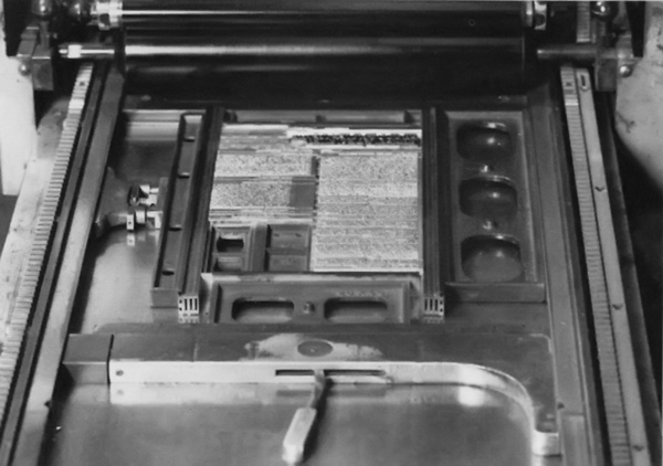
It should be noted that there is a difference between proofing type and actually printing it. A proofing press is a relatively small, slow-speed, hand-operated or power-operated press designed primarily for pulling a dozen or so proofs of each job. A printing press, on the other hand, is designed to operate auto matically at high speeds and print large quantities of a given job. The proofs pulled at the proofing press are called galley proofs or rough proofs. The reason for making these proofs is to allow both the typographer and the client to see that the job has been correctly set. Before the proof is sent to the client it is first proofread in the shop. Either the necessary corrections are made or it is indicated on the reader's proof that the errors have been noted and will be corrected. Several proofs, including the reader's proof, are then sent to the client for proofreading. These may be read by a proofreader, author, editor, or copy- writer, depending on the job. The designer also gets a proof so that he can make sure thejob has been set as specified. The corrections made on the various proofs are then transferred to a master proof. All corrections are marked eitherPE orAA. PE's are printer's errors and will be corrected free of charge by the typographer; AA's are the author's alterations and will be charged to the client. AA's include editor's or designer's changes.
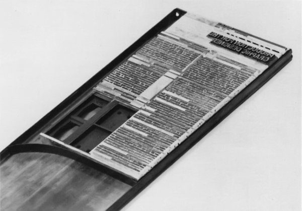
The master proof is returned to the typographer, who makes all the corrections indicated. The corrected type is then locked up on the bed of the proofing press and a new proof called a reproduction proof, or repro, is pulled on a special coated paper. The quality of this proof is of the utmost importance, as it is used by the designer in the preparation of his mechanicals: it will be photo graphed and made into a printing plate for eventual reproduction.
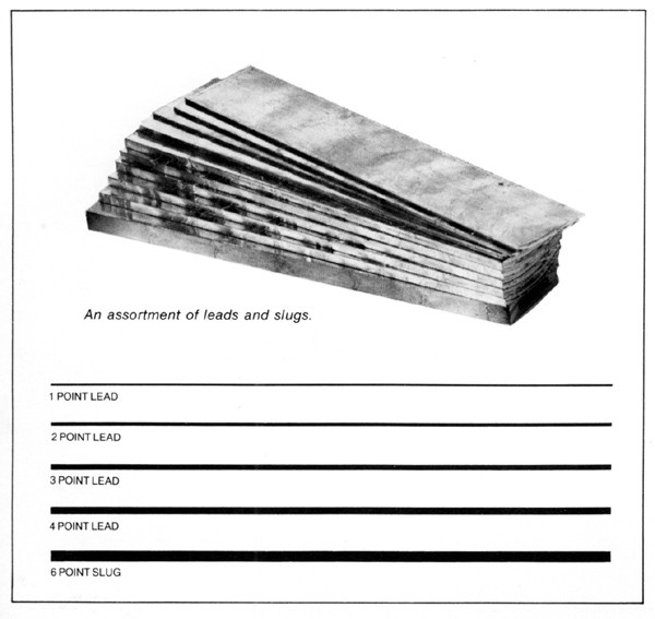
After the job is completed, the type is cleaned cleaned and distributed; that is, put back into the type case. Great care is taken in distributing type, as letters carelessly thrown into the wrong compartments may not show up until a new job is set and proofed. Compositors are warned to "watch their p's and q's," as it is very easy to confuse certain letters, especially these. The leads, slugs, and furniture, arranged by thickness and length, are also put away for future jobs.
Despite the speed and skill of the compositor, handset type is a relatively slow, time-consuming process and is therefore too expensive for lengthy type Handsetting is recommended, however, for short "takes" (small amounts of copy) of either text or display type.

Wednesday, September 27, 2006

Type locked up in a chase ready for proofing

Type form, locked up on the bed of proofing press

Type in galley, held in position with galley clips

Setting


First, the compositor adjusts the composing stick to the desired pica measure, or line length. To set type, he holds the composing stick in one hand and with the other he picks type from the type case. To justify the lines of type he adds additional wordspaces and/or letterspaces.

To create the proper amount of leading, the compositor inserts metal strips called leads between the lines. When the composing stick is full, the lines of type are transferred to a long shallow tray called a galley. The compositor continuesto set type until the galley is full or the job is completed. The next step is to "make up" the job; that is, to assemble

The various elements (text type, display type, rules, cuts, etc.) according to the designer's layout. If the job is small, it may be made up directly on the galley; if larger or more complex, it maybe made up(n an imposing table, traditionally known as the "stone." Because the type consists of hundreds of individual pieces, it is important that they be held together securely, or "locked up." This s done by tying up the type with string,

or by surrounding it with "furniture": strips of wood, metal, or plastic. These in turn are held firmly in place with metal clips or magnets. Type can be locked up in three ways: on the galley, in a metal frame called a chase, or directly on the bed of the press.

Collectively, type and other printed matter locked up and ready to be proofed or printed is called a form.

Handset

The process of setting type by hand has not changed since Gutenberg's time in the mid-15th century. The compositor, or typesetter, works with the same tools now as he did then: a composing stick, a type case (a shallow tray, divided into compartments, that holds the type), and the metal type itself (letters, punctuation marks, figures, and spaces). The type is known collectively as the font and individually as characters. Characters not part of a regular font are called sorts.

Unit System

The unit system is a measuring and counting system used by phototypesetting machines to determine when a line of type is readyto bejustified. It is based on the em of any point size of type being divided into equal, machine-recognizable increments called units.

What Is a Unit? A unit is a subdivision of the em (the square of the type size). The number of units to the em varies from one manufacturer to another, although the most common number is 18. (We shall use an 18-unit system for our discussion.) Also, the size of the unit, like the size of the em, varies from one type size to another. For example, a unit of 72pointtype will be larger than a unit of 36point type. A simple method to determine the size of a unit is to think of it as 1 /18 of the type size.

Measuring Type in Units. The set width of the individual characters and spaces must be measurable in units. Therefore, each character is designed with a fixed unit width or unit value. This unit value also includes a small amount of space on either side of the characters to prevent them from touching when set.

To get an idea how this system works let's set the word Mat on an 18-unit system. The cap M is 18 units wide, the lowercase a 10 units wide, and the lowercase t 6 units wide. So the entire word is 34 units wide, regardless of the type size. By thus totaling the unit values of the characters and the spaces between the words, a counting mechanism (which can be part of the keyboard, computer, or phototypesetter) is able to measure a line of type in units and determine when it is ready to be justified.

Advantages of the Unit System. One advantage of using the unit system is that the .color" of the setting can be controlled by adjusting the units of space between the letters. This means that the type can be set with regular, loose, or VA, etc.

tight letters pacing. Letterspacing can also be adjusted on a selective basis, reducing space between certain letters while the rest of the setting remains the same. This is called kerning and is usually used in letter combinations that are improved by the deletion of one or two units of space, such as Te, Ta, Ve, AW,

Although the most common, the 18 is not an industry standard. The number of units to the em varies with the manufacturer and may be 4, 9, 12, 18, 32, 36, 48, or 64. The more units to the em, the closer together the letters can fit (let he more flexibility there is in wordspacing and letterspacing. However, although a greater number of units to the em results in a greater possibility of typographic refinement, for the averagejob there is a point beyond which further refinement is neither necessary nor noticeable.

Arranging Lines of Type

There are five basic ways to arrange lines of type on a page. (1) Justified: all the lines are the same length and align both on the left and on the right. (2) Unjustified: the lines are of different lengths and align on the left and are ragged on the right. (3) A similar arrangement, except now the lines align on the right and are ragged on the left. (4) Centered: the lines are of unequal lengths with both sides ragged. (5) An asymmetrical arrangement with no predictable pattern in the placement of the lines.

Leading

In addition to the space between words and letters, it is also possible to vary the space between the lines of type. To accomplish this, metal strips of various thickness are placed between the lines. This is called leading (pronounced ledding). The metal strips, called leads (leds), are measured in points. The most common sizes are 1, 2, 3, and 4 point. Leads 6 points or more in thickness are called slugs and are cast in 6, 12, 24, and 36 point. Both leads and slugs are less than type-high and thereforedo not print.

Type that is set without leading is said to be set solid. If 10-point type is set with 1-point leading, it is set "10 on 11,'' which is indicated 10/11: the first figure indicates the type size; the second figure, the type size plus the leading. The type you are now reading is 9/11 Helvetica; that is, 9-point type with 2 points of leading.

Tuesday, September 26, 2006

Letterspacing


Spacing between letters. The spacing materials used for letterspacing are very thin. Most fonts have spaces of 1 point (made of brass) that can be used singly or in groups. Others are even thinner: 1/2 point (copper) and 1/4 point (stainless steel). There is even a letterspace made of paper. Consider how thin a piece of paper is-this will give you an indication of just how finely letterspacing can be adjusted.

Wordspacing


Spacing between words. Wordspacing is accomplished mechanically by inserting pieces of metal (spaces) between words. Being lower than the printing face of the type itself, they do not come in contact with the paper and therefore do not print. These pieces of metal, called spaces and quads, are related in size to the em quad, which is the square of the type size. For example, if the type is 60 point, the em quad is a square 60 points x 60 points; if the type is 10 point, the em quad is 10 points square. Since an em quad would produce too much space between

words, smaller pieces of metal, which are subdivisions of the em quad, are used. Normal wordspacing assumes the use of 3-to-the-em spaces.

Type.


The individual letter, figure, or punctuation mark is called a character. The large letters are called caps or uppercase characters; the small letters are called lowercase characters. A complete alphabet of one style of uppercase and lowercase characters, with figures and punctuation marks, is called a font. If we group together all the type sizes and type styles of a particular typeface (roman, italic, bold, extended, condensed, etc.), we get a family of type.

Typography

The basic terminology used in all typesetting methods is derived from metal type. As we shall see later, some of the terms have been modified to accommodate the newer typesetting methods, such as phototypesetting, but most are still in use today, regardless of the typesetting method.

Typesetting

Typesetting, also called composition, was traditionally done by the printer. Until this century most printing shops had their own composing room and compositor, or typesetter. Today, most printers have given over the function of typesetting to the typographer, who operates independently.

In this section we shall discuss the four ways type is set: by hand, machine (casting), typewriter, and phototypesetting. We shall begin with a brief review of the basics of typography in order to define the terminology that we will be using throughout.